PRESIDENT’S SUITE REDESIGN
PROJECT SCOPE
Brand Strategy
Environmental Design
THE CHALLENGE
Redesign the President’s Suite at Miami’s football stadium to incorporate campaign branding.
The Brief: As a designer for Advancement at Miami, I was tasked with the redesign and updating of the President’s Suite space where donors and other guests of the President reside while watching games. The task was to incorporate the branding of their new capital campaign, For love. For honor. For those who will. while also evoking a game day feeling. This was a collaboration with Athletics, Advancement, and the President’s Office.
Inspiration Gathering
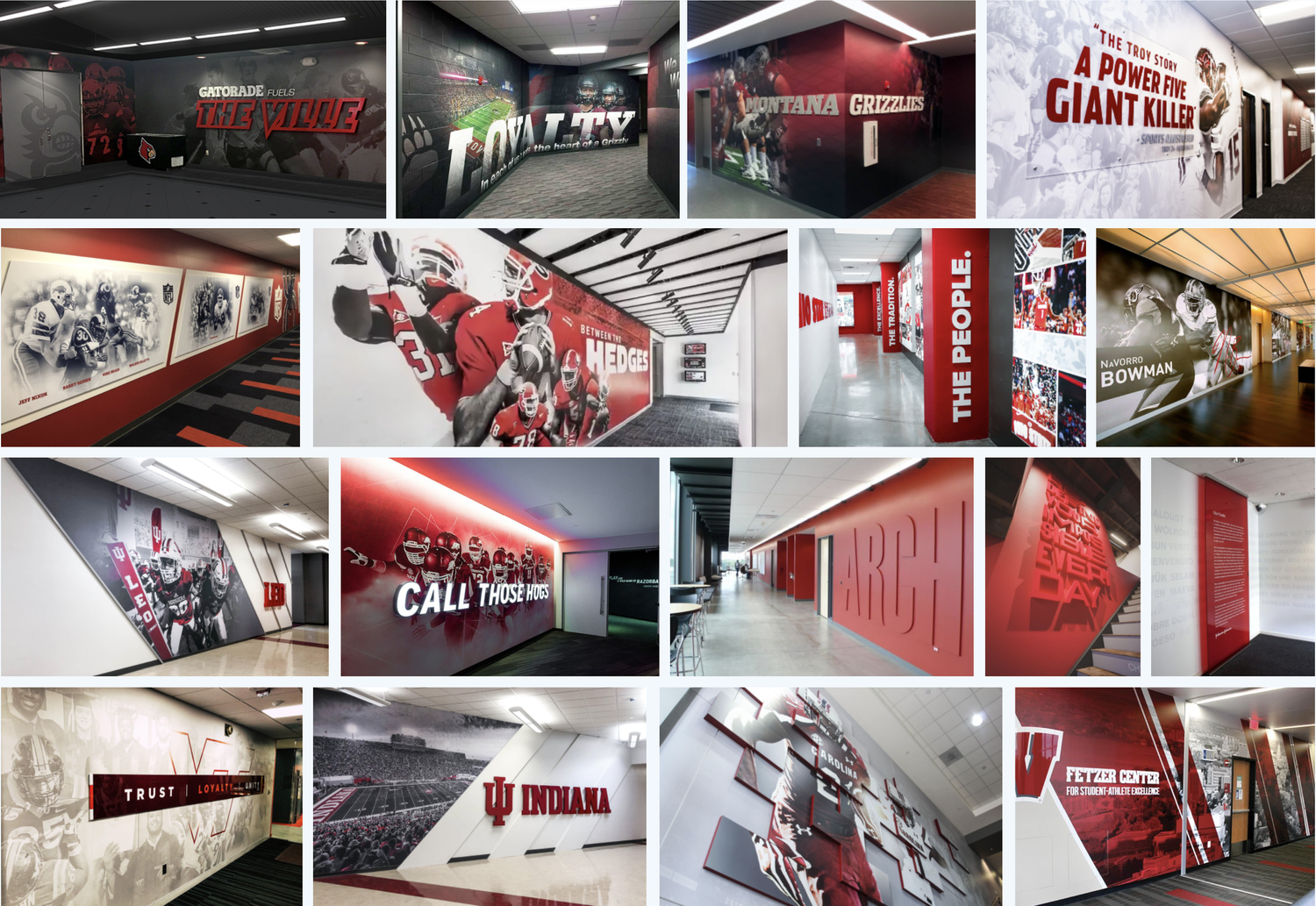
Having never done a project of this scope before, my first step was to benchmark what similar spaces looked like for other colleges and football teams. This gave me a solid starting point to build from.
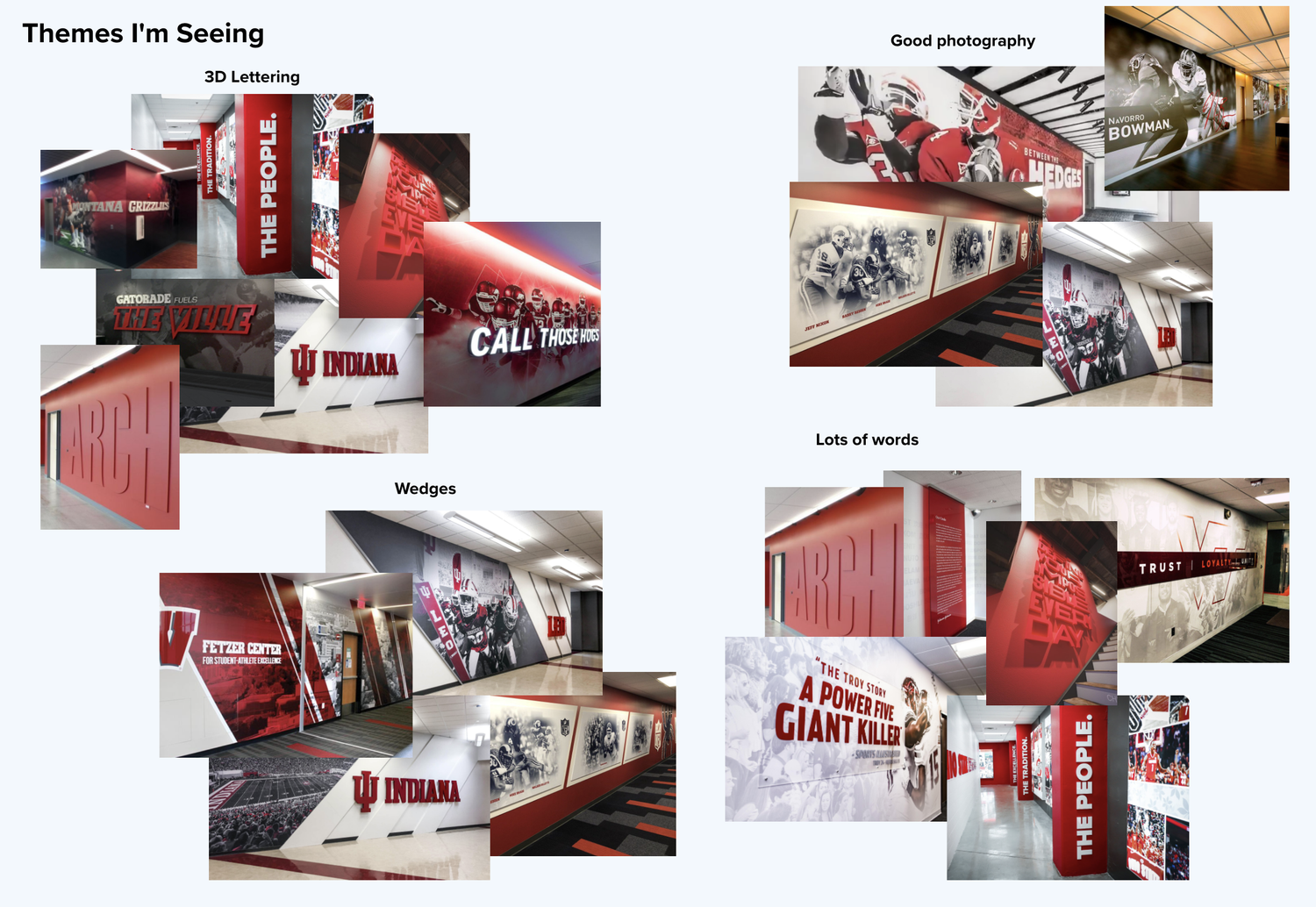
Themes
After looking through what other colleges and professional teams were doing, themes started to emerge. There were repeated styles and elements that served as inspiration for my design concepts. There are many 3D elements, large photography, wedges, and verbiage on the walls.
ROUGH CONCEPTS
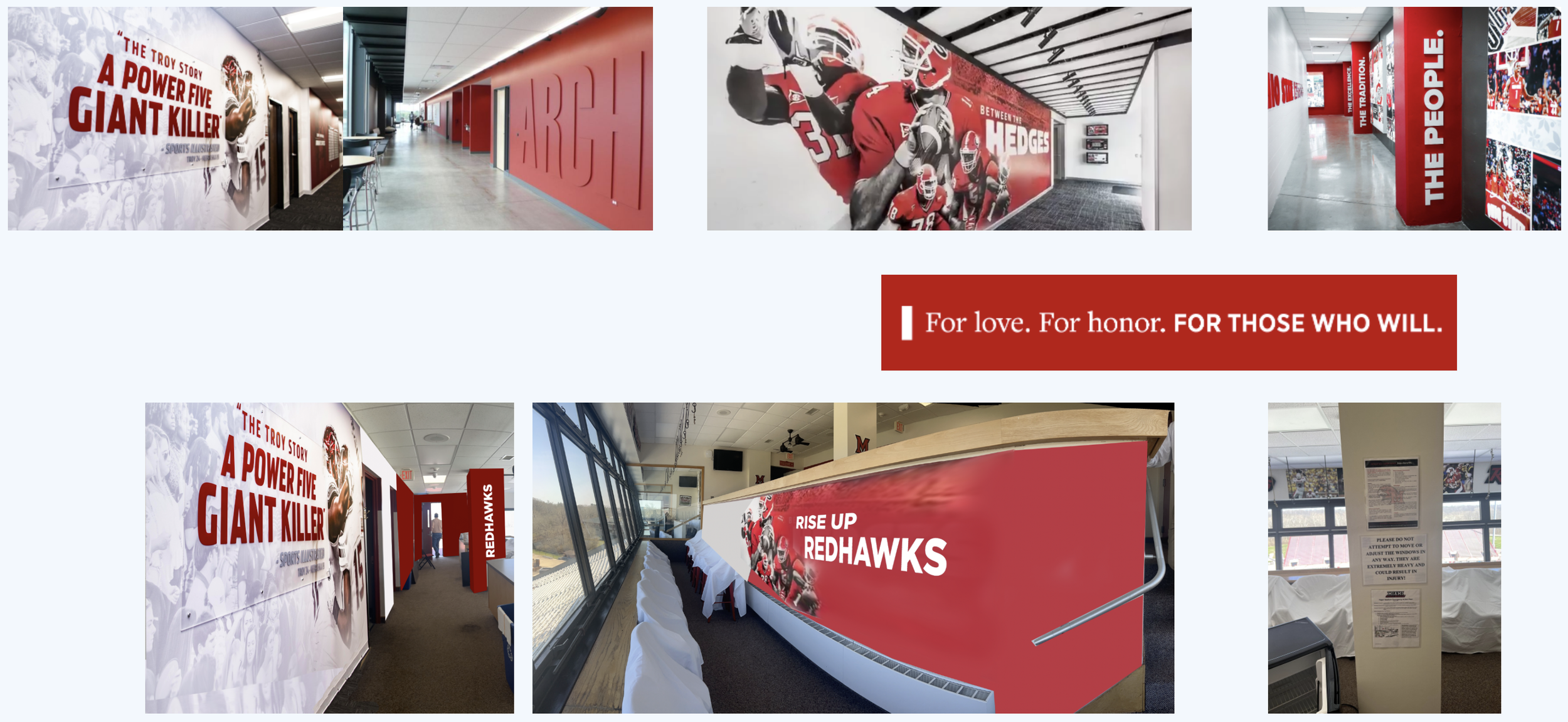
Option 1: Photography and 3D elements
The wedge element that was seen in other spaces is a new addition to the Miami campaign brand, so it allowed for a simple way to begin integrating it with athletics visuals. There were also many 3D examples of large elements so I incorporated that as well.
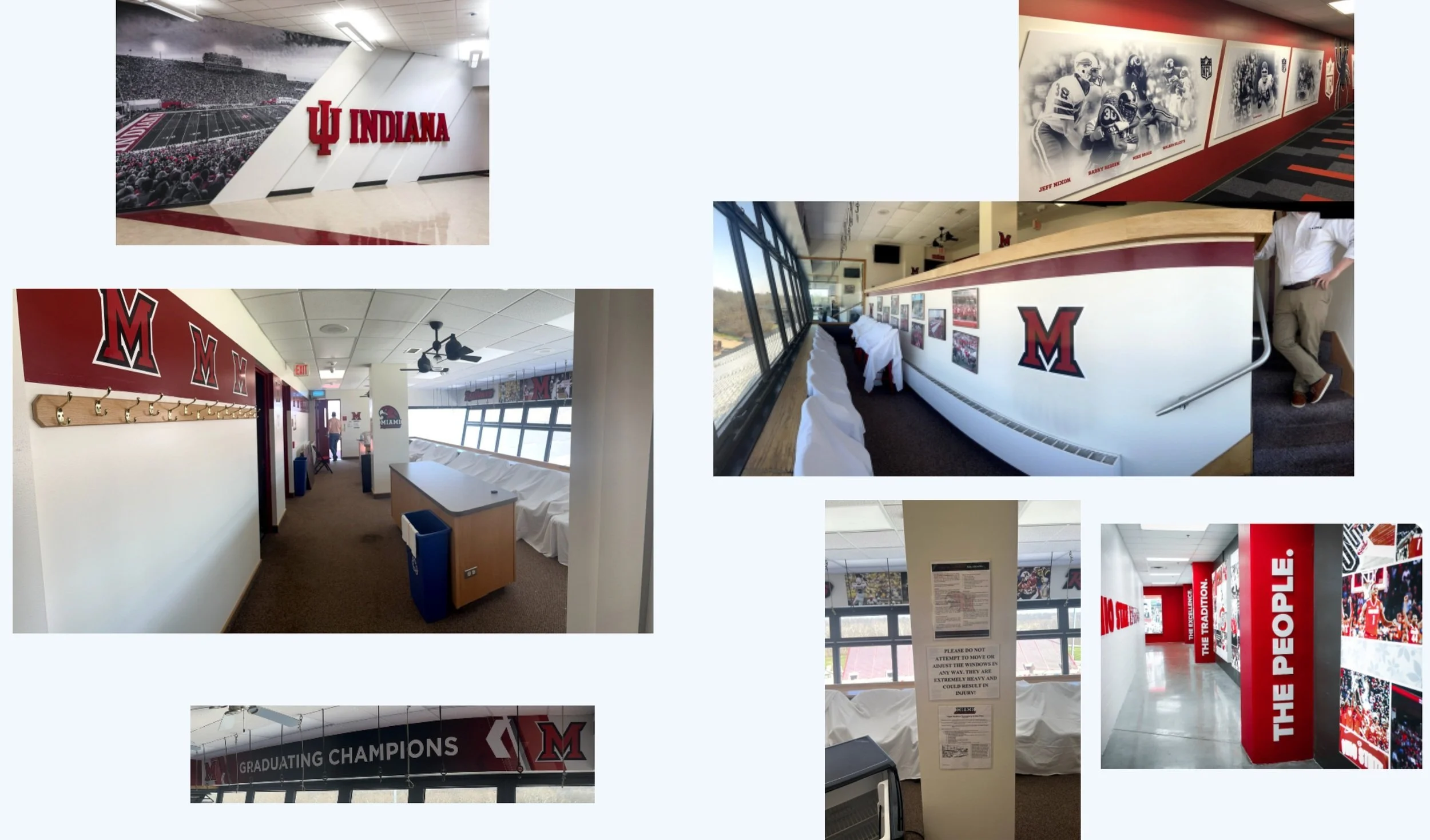
Option 2: Wedge and Hall of Fame
The wedge element that was seen in other spaces is a new addition to the Miami campaign brand, so it allowed for a simple way to begin integrating it with athletics visuals. Also included is a hall of fame but a major concern with that is how quickly it could become out of date.
DESIGN OPTIONS
After meeting with the client, a combination of both concepts was chosen, using the wedge elements from concept 2 and the 3D elements from concept 1. After this decision was made, it was now time to come up with different options for each space within the room.


THE LOWER WALL
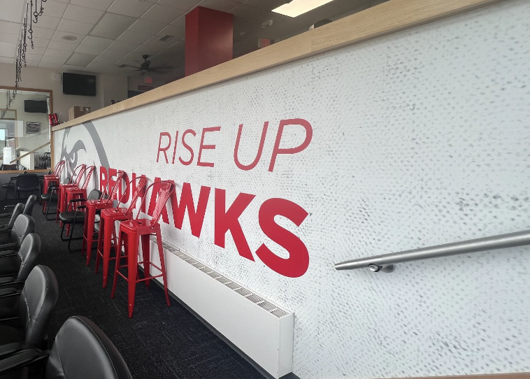
The lower wall would be behind those sitting and watching the game. A major consideration for this area was that the sun comes in directly and uninterrupted through the windows. Though our vendor believed their red would last for a decent period of time, in the end we selected the white option. It also helps to balance out the red of the rest of the room. I didn’t want it to become too overwhelming when all of the pieces were installed together.
THE BACK WALL
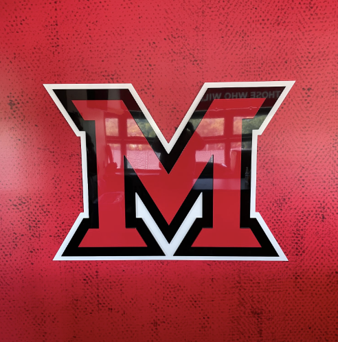
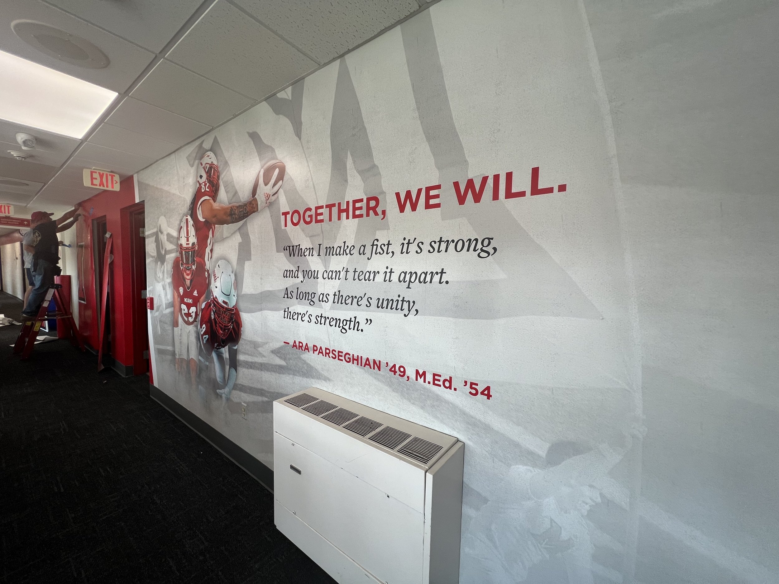
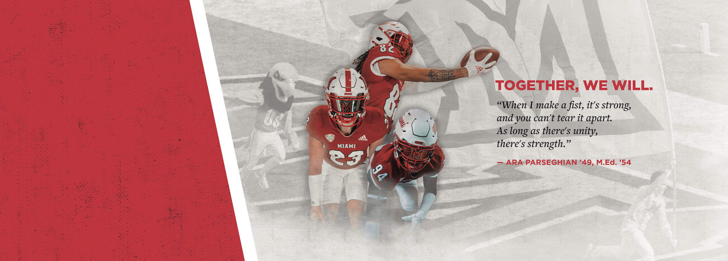
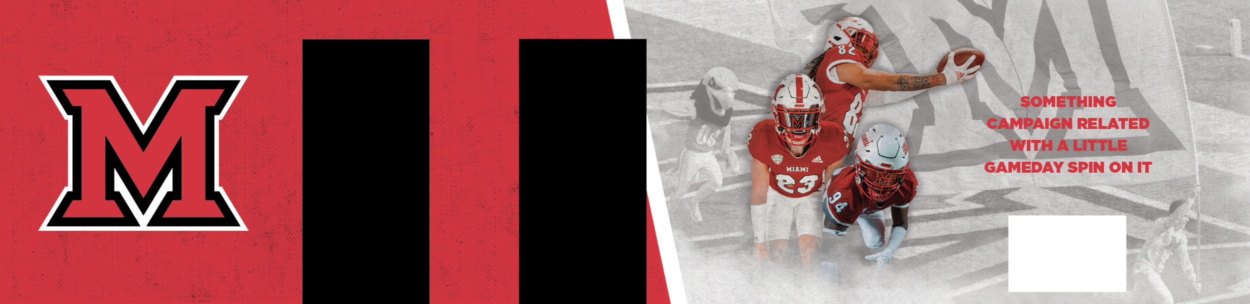
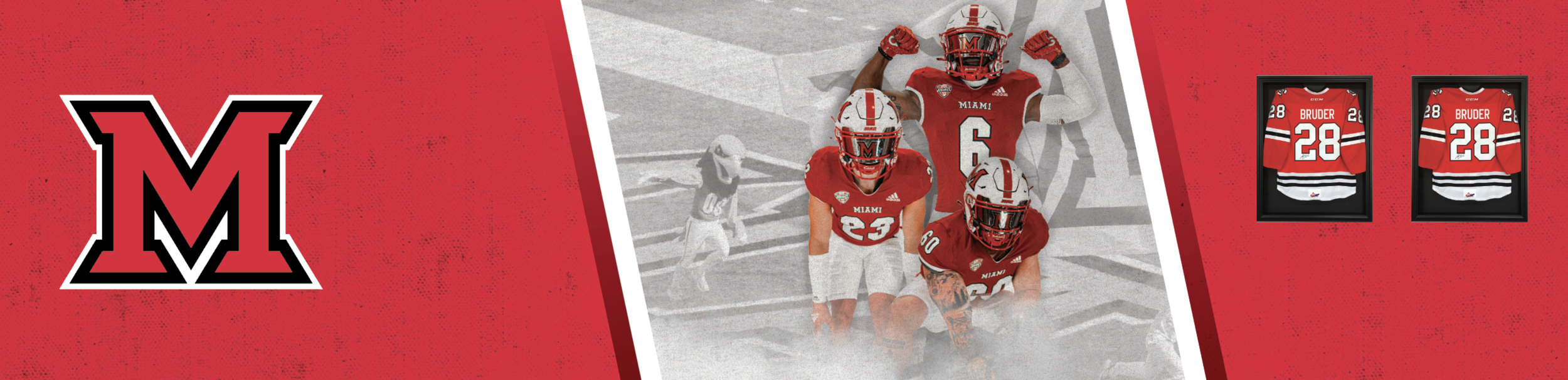
The next challenge I faced were the two walls in the back wall, which would largely cut into the graphics and a heater on the right side of the wall, seen in the top concept. I knew I wanted the block M to be a large 3D element, so I moved it to the smaller stretch of wall to allow the player photography to be larger than life on the longer stretch of space. In the end, the top concept was chosen because of the branding opportunity I created to take up the space above the heater.



THE PILLAR AND HEADER
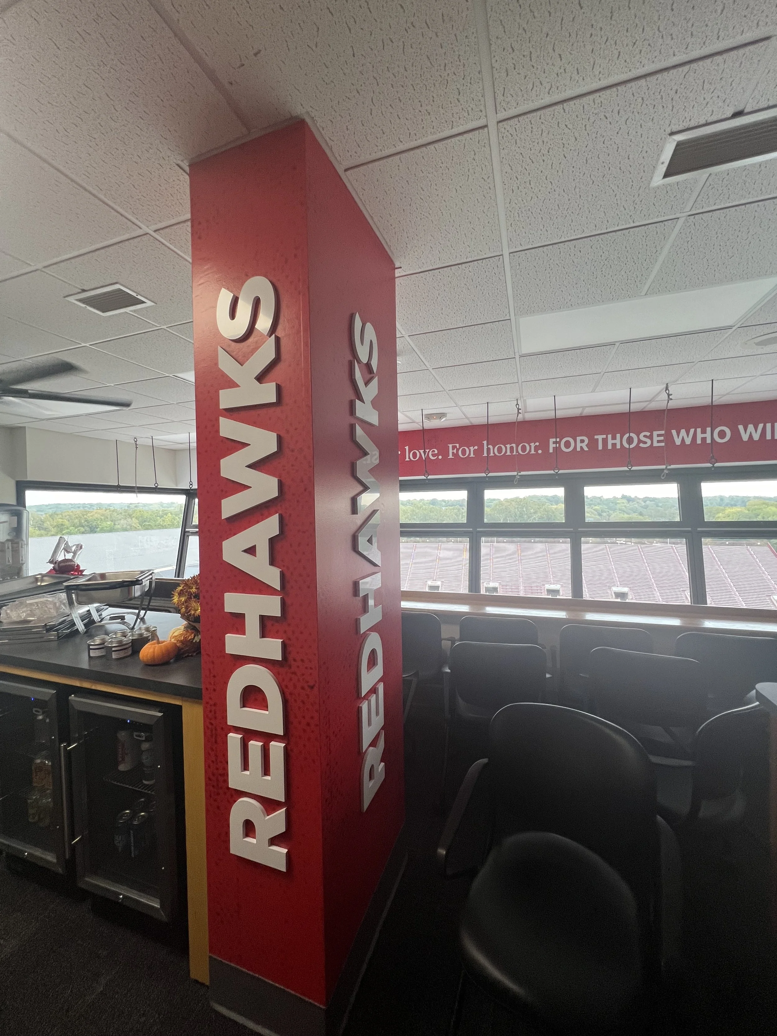
The smaller spaces to add design elements were the pillar in the middle of the room, and a small gap above the windows looking over the field. I knew I wanted to wrap the pillar and add some dimension for the light to play off of by having “Redhawks” stand off from it.
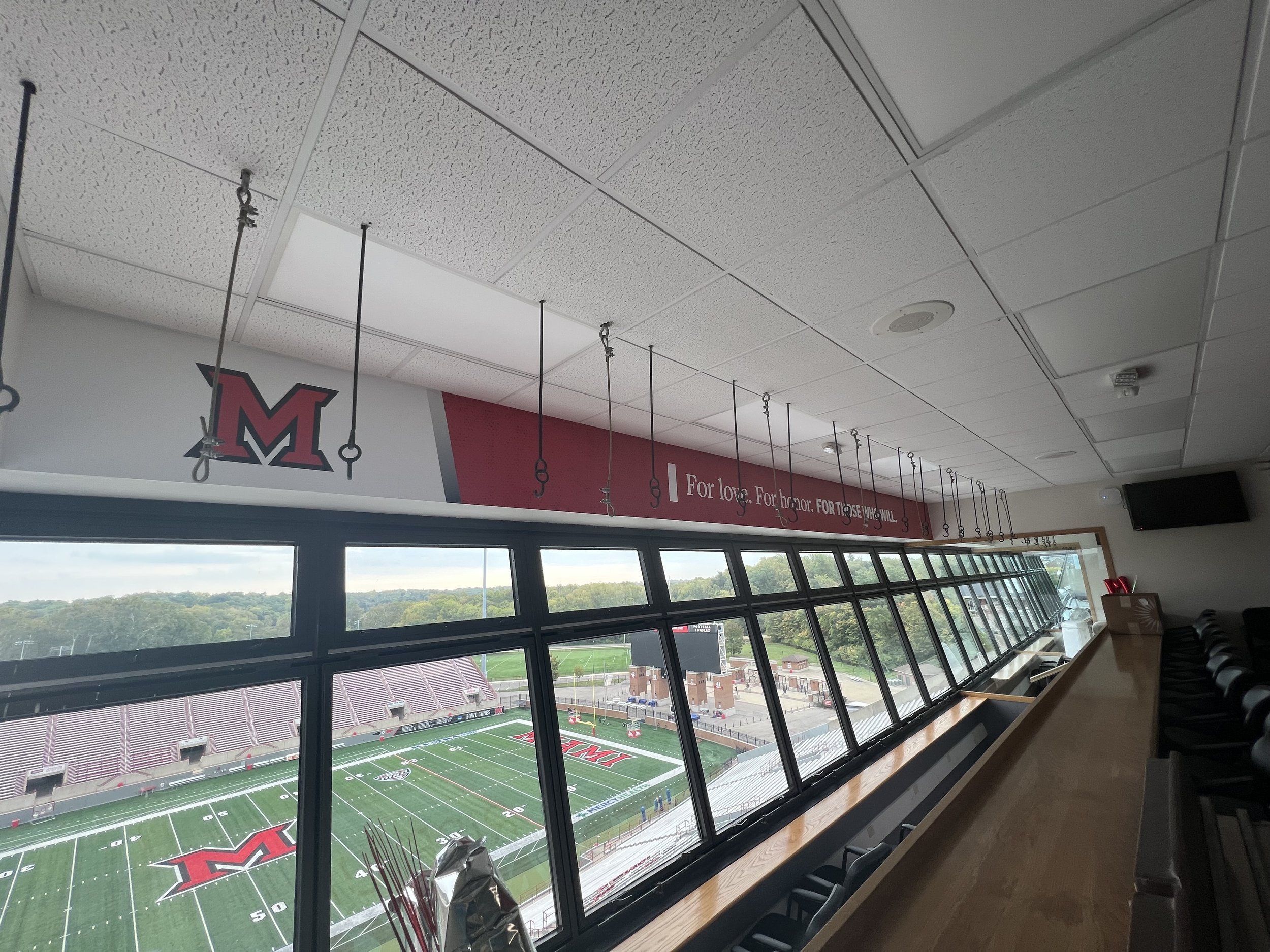
The header was a great place to work in more campaign branding, as it is such a long and skinny area. The “For Those Who Will” portion is also a 3D element. The bottom option was chosen because we wanted to include Miami branding no matter which direction the user looked in the space.
FINAL INSTALL
After meeting with the client, a combination of both concepts was chosen, using the wedge elements from concept 2 and the 3D elements from concept 1. After this decision was made, it was now time to come up with different options for each space within the room.
-
![]()
Header
-
![]()
3D M
-
![]()
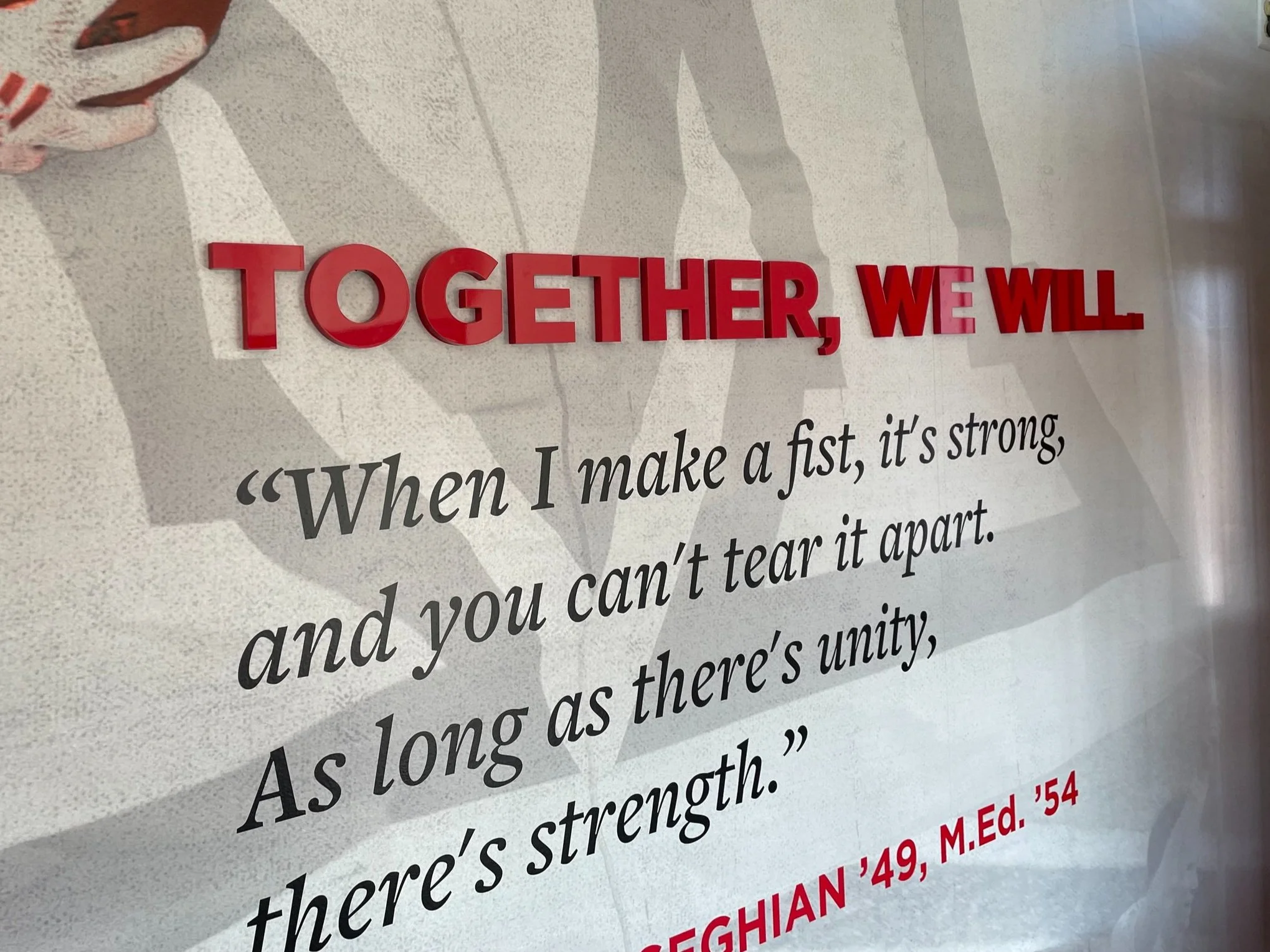
Back Wall Quote
-
![]()
Lower Wall
-
![]()
Pillar
-
![]()
Back Wall